
CSS旋转折扇小案例
钱满满 发布于
阅读:1748
<!DOCTYPE html>
<html lang="en">
<head>
    <meta charset="UTF-8">
    <meta name="viewport" content="width=device-width, initial-scale=1.0">
    <title>Document</title>
    <style>
        * {
            padding: 0;
            margin: 0;
        }

        ul {
            /* 不显示列表前的符号 */
            list-style: none;
        }

        ul {
            margin: 10px auto;
            width: 600px;
            height: 400px;
            border: 5px solid gray;
            position: relative;
        }

        li {
            width: 60px;
            height: 200px;
            position: absolute;
            left: 50%;
            margin-left: -30px;
            bottom: 30px;
            text-align: center;
            /* 设置旋转中心点 */
            transform-origin: bottom center;
            border-radius: 10px;
            transition: all 2s;
        }

        /* 除了第七个,其他都透明 */
        ul li:not(:nth-child(7))  {
            opacity: 0;
        }

        ul:hover li {
            opacity: 1;
        }

        ul li:nth-child(1), ul li:nth-child(13) {
            background: purple;
        }

        ul li:nth-child(2), ul li:nth-child(12) {
            background: darkblue;
        }

        ul li:nth-child(3), ul li:nth-child(11) {
            background: deeppink;
        }

        ul li:nth-child(4), ul li:nth-child(10) {
            background: deepskyblue;
        }

        ul li:nth-child(5), ul li:nth-child(9) {
            background: green;
        }

        ul li:nth-child(6), ul li:nth-child(8) {
            background: yellow;
        }

        ul li:nth-child(7) {
            background: red;
        }

        ul:hover li:nth-child(1) {
            transform: rotate(90deg);
        }

        ul:hover li:nth-child(13) {
            transform: rotate(-90deg);
        }

        ul:hover li:nth-child(2) {
            transform: rotate(75deg);
        }

        ul:hover li:nth-child(12) {
            transform: rotate(-75deg);
        }

        ul:hover li:nth-child(3) {
            transform: rotate(60deg);
        }

        ul:hover li:nth-child(11) {
            transform: rotate(-60deg);
        }

        ul:hover li:nth-child(4) {
            transform: rotate(45deg);
        }

        ul:hover li:nth-child(10) {
            transform: rotate(-45deg);
        }

        ul:hover li:nth-child(5) {
            transform: rotate(30deg);
        }

        ul:hover li:nth-child(9) {
            transform: rotate(-30deg);
        }

        ul:hover li:nth-child(6) {
            transform: rotate(15deg);
        }

        ul:hover li:nth-child(8) {
            transform: rotate(-15deg);
        }
    </style>
</head>
<body>
    <ul>
        <li>1</li>
        <li>2</li>
        <li>3</li>
        <li>4</li>
        <li>5</li>
        <li>6</li>
        <li>7</li>
        <li>8</li>
        <li>9</li>
        <li>10</li>
        <li>11</li>
        <li>12</li>
        <li>13</li>
    </ul>
</body>
</html>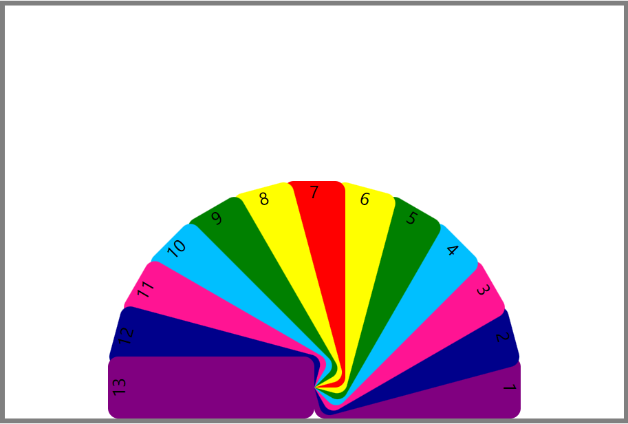
扫描二维码,在手机上阅读
需要登录才能发表回复
请登录或注册以继续。